
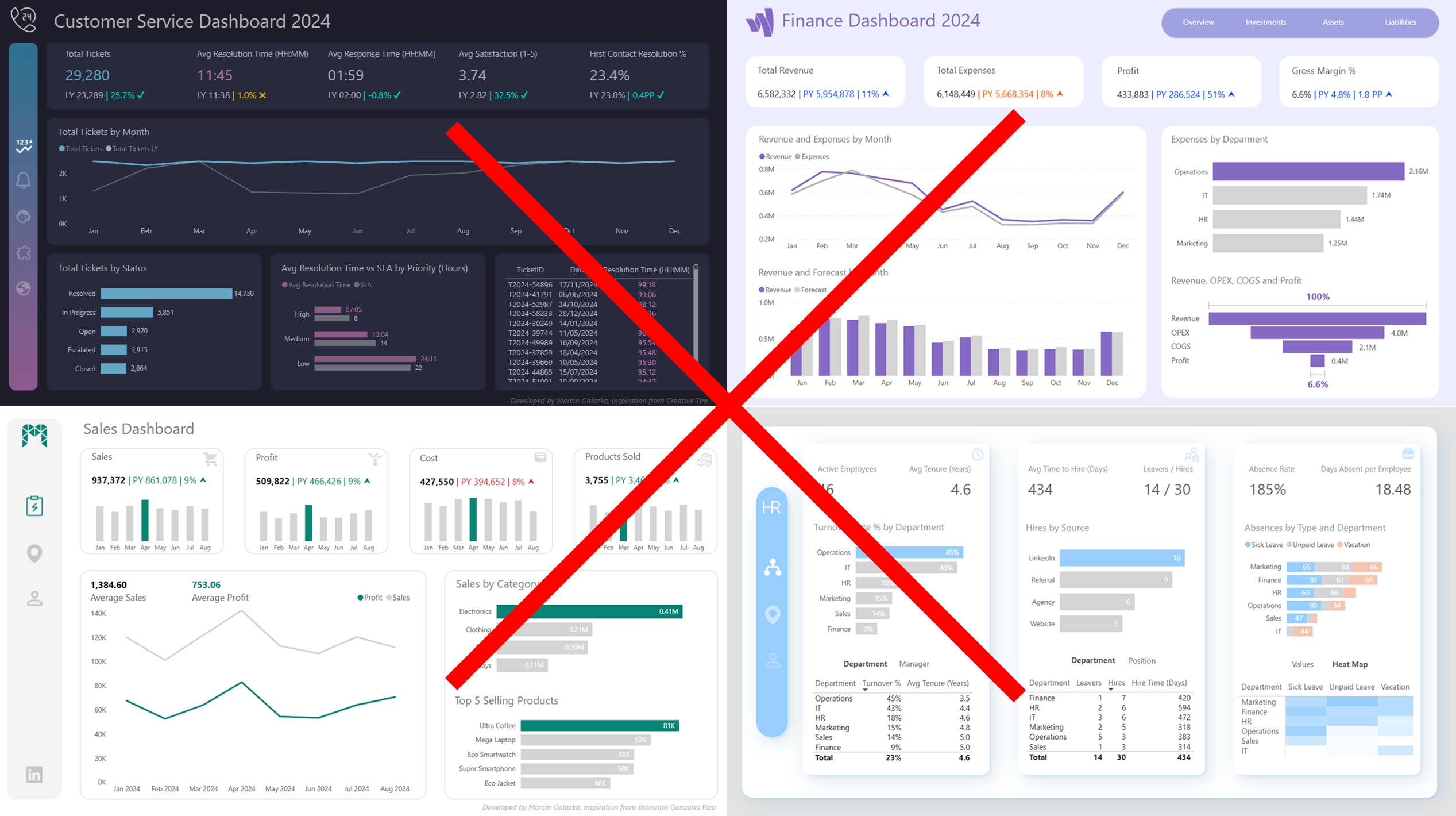
All Your dashboards look different.
Fix it and scale it company wide.
The Power BI Design System that unifies every dashboard in your company. One JSON theme, one set of layouts, one visual standard, deployed in weeks, not months.
Sounds familiar?

Every Dashboard Looks Different
Different colors, fonts, spacing, layouts across reports. Every new developer brings their own style. Executives notice the inconsistency and start questioning the data itself.

Formatting Takes Forever
Your team spends hours on manual formatting instead of development. Every change request turns into a design debate. Lack of reusable assets causes slow development.

No Design Ownership
Nobody owns the visual standard. Style guides get ignored because they rely on memory and taste. The chaos multiplies with every new dashboard.
See the Difference a Design System Makes
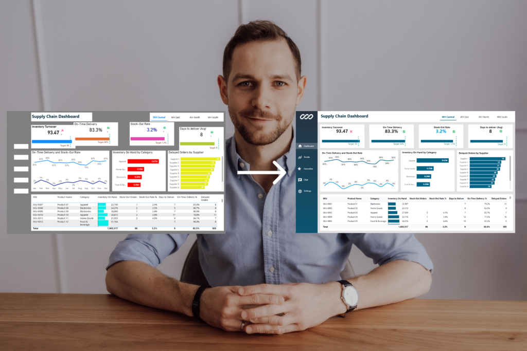
Left: a typical dashboard built without standards.
Right: the same data with the Power BI Design System applied.
Same report. Same data model. Completely different level of trust and professionalism. The transformation takes hours, not weeks.
One System.
Every Dashboard unified.
The Power BI Design System is a complete framework that standardizes how your organization builds dashboards. It replaces manual formatting with automated, reusable assets your entire team can use from day one.

Core Theme (JSON)
4,000+ lines of code that instantly apply your brand colors, fonts and formatting to every standard Power BI visual. Load it once and 90% of manual formatting disappears. Distribute it to every developer in your org.

Branch Layout Studio (Figma)
Page templates with consistent grid, spacing and hierarchy. Export layouts directly into Power BI as background images. Your team stops guessing where to place visuals and starts developing faster.

PBIX Master (Reference Report)
A complete sample report showcasing standard visuals styled with your brand. Use it as a reference for any dashboard your team builds. Copy the patterns and scale them across departments.
What You Get

Faster development, no design debates
Manual formatting reduced up to
90 % by Core Theme
Same look and feel for every dashboard
Executive-ready design by default
Watch Dashboard Transformation in 1 minute
See how the Design System transforms a default Power BI report into a branded, professional dashboard.
Same data. Same visuals. Completely different result.
Go Live in 3 steps

Step 1: Brand Adaptation
We adapt the Design System to your company branding. Your colors, your fonts, your logo – locked into the Core Theme JSON and Layout Studio. This takes hours, not weeks.

Step 2: Pilot & Approval
We redesign one page of your existing report, so stakeholders can see the result before full rollout. You approve the visual standard, we move forward.

Step 3: Scale Company-Wide
Distribute the Core JSON theme and layouts to your entire team. Every developer builds with the same standard. New dashboards developed faster. Design debates stop.

About
I spent 5+ years with different Power BI environments.
At one point I was managing platform with 400 dashboards
and 2,000 users across multiple business domains.
I saw the same problem everywhere: every developer formats dashboards differently, every report looks random, and BI teams waste hours on design instead of insights.
That is why I implement the Power BI Design System, a framework that fixes this once and scales across your entire organization.

5+ Years
in Power BI

2000+ users
supported

400+ Dashboards
managed
Common questions
Q: Will my developers lose flexibility?
No. They gain speed and a unified baseline. The system handles 90% of formatting automatically. Developers can still customize for specific needs, they just start from a professional standard instead of a blank canvas.
Q: How does this fit our existing governance?
The Design System is a set of files: a JSON Core theme, Figma layouts, and a reference report. No server product, no platform dependency. It slots into whatever governance you already have. You keep full ownership.
Q: What about performance impact?
Zero performance impact. The JSON theme is lightweight and the Figma layouts are exported as simple background images.
Q: How long does implementation take?
Quick win on day one. A full brand adaptation and pilot can be done within a week. Company-wide rollout typically 2-3 weeks.
Q: What if we have external consultants building reports?
That is exactly when you need this the most. Hand every consultant the JSON theme and layout templates on day one. Their reports will match your internal standard automatically, regardless of who builds them.